
By Favio Vazquez, Founder at Ciencia y Datos.

Editor’s note: This post covers Favio’s selections for the top 7 R packages of 2018. Yesterday’s post covered his top 7 Python libraries of the year.

Introduction
If you follow me, you know that this year I started a series called Weekly Digest for Data Science and AI: Python & R, where I highlighted the best libraries, repos, packages, and tools that help us be better data scientists for all kinds of tasks.
The great folks at Heartbeat sponsored a lot of these digests, and they asked me to create a list of the best of the best—those libraries that really changed or improved the way we worked this year (and beyond).
If you want to read the past digests, take a look here:
Disclaimer: This list is based on the libraries and packages I reviewed in my personal newsletter. All of them were trending in one way or another among programmers, data scientists, and AI enthusiasts. Some of them were created before 2018, but if they were trending, they could be considered.
Top 7 for R

7. infer — An R package for tidyverse-friendly statistical inference
https://github.com/tidymodels/infer
Inference, or statistical inference, is the process of using data analysis to deduce properties of an underlying probability distribution.
The objective of this package is to perform statistical inference using an expressive statistical grammar that coheres with the tidyverse design framework.
Installation
To install the current stable version of infer from CRAN:
install.packages("infer")
Usage
Let’s try a simple example on the mtcars dataset to see what the library can do for us.
First, let’s overwrite mtcars so that the variables cyl, vs, am, gear, and carb are factors.
library(infer)
library(dplyr)
mtcars <- mtcars %>%
  mutate(cyl = factor(cyl),
         vs = factor(vs),
         am = factor(am),
         gear = factor(gear),
         carb = factor(carb))
# For reproducibility
set.seed(2018)
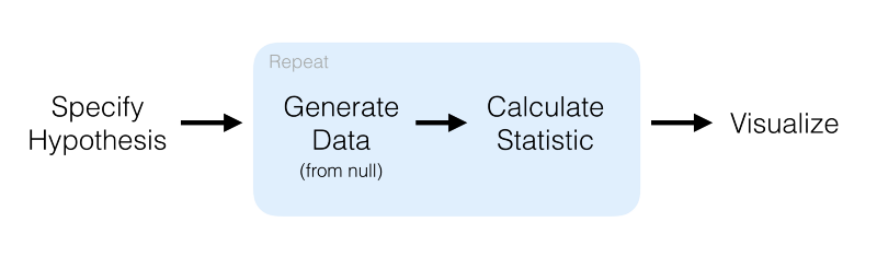
We’ll try hypothesis testing. Here, a hypothesis is proposed so that it’s testable on the basis of observing a process that’s modeled via a set of random variables. Normally, two statistical data sets are compared, or a data set obtained by sampling is compared against a synthetic data set from an idealized model.
mtcars %>%
  specify(response = mpg) %>% # formula alt: mpg ~ NULL
  hypothesize(null = "point", med = 26) %>%
  generate(reps = 100, type = "bootstrap") %>%
  calculate(stat = "median")
Here, we first specify the response and explanatory variables, then we declare a null hypothesis. After that, we generate resamples using bootstrap and finally calculate the median. The result of that code is:
## # A tibble: 100 x 2
##    replicate  stat
##        <int> <dbl>
##  1         1  26.6
##  2         2  25.1
##  3         3  25.2
##  4         4  24.7
##  5         5  24.6
##  6         6  25.8
##  7         7  24.7
##  8         8  25.6
##  9         9  25.0
## 10        10  25.1
## # ... with 90 more rows
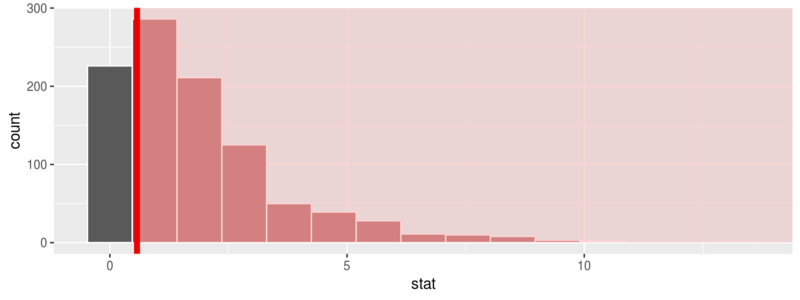
One of the greatest parts of this library is the visualize function. This will allow you to visualize the distribution of the simulation-based inferential statistics or the theoretical distribution (or both). For an example, let’s use the flights data set. First, let’s do some data preparation:
library(nycflights13)
library(dplyr)
library(ggplot2)
library(stringr)
library(infer)
set.seed(2017)
fli_small <- flights %>%
  na.omit() %>%
  sample_n(size = 500) %>%
  mutate(season = case_when(
    month %in% c(10:12, 1:3) ~ "winter",
    month %in% c(4:9) ~ "summer"
  )) %>%
  mutate(day_hour = case_when(
    between(hour, 1, 12) ~ "morning",
    between(hour, 13, 24) ~ "not morning"
  )) %>%
  select(arr_delay, dep_delay, season,
         day_hour, origin, carrier)
And now we can run a randomization approach to χ2-statistic:
chisq_null_distn <- fli_small %>%
  specify(origin ~ season) %>% # alt: response = origin, explanatory = season
  hypothesize(null = "independence") %>%
  generate(reps = 1000, type = "permute") %>%
  calculate(stat = "Chisq")
chisq_null_distn %>% visualize(obs_stat = obs_chisq, direction = "greater")
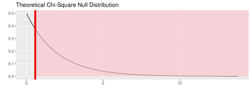
or see the theoretical distribution:
fli_small %>%
  specify(origin ~ season) %>%
  hypothesize(null = "independence") %>%
  # generate() ## Not used for theoretical
  calculate(stat = "Chisq") %>%
  visualize(method = "theoretical", obs_stat = obs_chisq, direction = "right")
For more on this package visit:
6. janitor — simple tools for data cleaning in R

https://github.com/sfirke/janitor
Data cleansing is a topic very close to me. I’ve been working with my team at Iron-AI to create a tool for Python called Optimus. You can see more about it here:
But this tool I’m showing you is a very cool package with simple functions for data cleaning.
It has three main functions:
- perfectly format
data.framecolumn names; - create and format frequency tables of one, two, or three variables (think an improved
table(); and - isolate partially-duplicate records.
Oh, and it’s a tidyverse-oriented package. Specifically, it works nicely with the %>% pipe and is optimized for cleaning data brought in with the readr and readxl packages.
Installation
install.packages("janitor")
Usage
I’m using the example from the repo, and the data dirty_data.xlsx.
library(pacman) # for loading packages
p_load(readxl, janitor, dplyr, here)

roster_raw <- read_excel(here("dirty_data.xlsx")) # available at http://github.com/sfirke/janitor
glimpse(roster_raw)
#> Observations: 13
#> Variables: 11
#> $ `First Name`        <chr> "Jason", "Jason", "Alicia", "Ada", "Desus", "Chien-Shiung", "Chien-Shiung", N...
#> $ `Last Name`         <chr> "Bourne", "Bourne", "Keys", "Lovelace", "Nice", "Wu", "Wu", NA, "Joyce", "Lam...
#> $ `Employee Status`   <chr> "Teacher", "Teacher", "Teacher", "Teacher", "Administration", "Teacher", "Tea...
#> $ Subject             <chr> "PE", "Drafting", "Music", NA, "Dean", "Physics", "Chemistry", NA, "English",...
#> $ `Hire Date`         <dbl> 39690, 39690, 37118, 27515, 41431, 11037, 11037, NA, 32994, 27919, 42221, 347...
#> $ `% Allocated`       <dbl> 0.75, 0.25, 1.00, 1.00, 1.00, 0.50, 0.50, NA, 0.50, 0.50, NA, NA, 0.80
#> $ `Full time?`        <chr> "Yes", "Yes", "Yes", "Yes", "Yes", "Yes", "Yes", NA, "No", "No", "No", "No", ...
#> $ `do not edit! --->` <lgl> NA, NA, NA, NA, NA, NA, NA, NA, NA, NA, NA, NA, NA
#> $ Certification       <chr> "Physical ed", "Physical ed", "Instr. music", "PENDING", "PENDING", "Science ...
#> $ Certification__1    <chr> "Theater", "Theater", "Vocal music", "Computers", NA, "Physics", "Physics", N...
#> $ Certification__2    <lgl> NA, NA, NA, NA, NA, NA, NA, NA, NA, NA, NA, NA, NA
With this:
roster <- roster_raw %>%
  clean_names() %>%
  remove_empty(c("rows", "cols")) %>%
  mutate(hire_date = excel_numeric_to_date(hire_date),
         cert = coalesce(certification, certification_1)) %>% # from dplyr
  select(-certification, -certification_1) # drop unwanted columns
With the clean_names() function, we’re telling R that we’re about to use janitor. Then we clean the empty rows and columns, and then using dplyr we change the format for the dates, create a new column with the information of certificationand certification_1, and then drop them.
And with this piece of code…
roster %>% get_dupes(first_name, last_name)
we can find duplicated records that have the same name and last name.
The package also introduces the tabyl function that tabulates the data, like table but pipe-able, data.frame-based, and fully featured. For example:
roster %>%
  tabyl(subject)
#>     subject n    percent valid_percent
#>  Basketball 1 0.08333333           0.1
#>   Chemistry 1 0.08333333           0.1
#>        Dean 1 0.08333333           0.1
#>    Drafting 1 0.08333333           0.1
#>     English 2 0.16666667           0.2
#>       Music 1 0.08333333           0.1
#>          PE 1 0.08333333           0.1
#>     Physics 1 0.08333333           0.1
#>     Science 1 0.08333333           0.1
#>        <NA> 2 0.16666667            NA
You can do a lot more things with the package, so visit their site and give them some love 🙂
5. Esquisse — RStudio add-in to make plots with ggplot2

https://github.com/dreamRs/esquisse
This add-in allows you to interactively explore your data by visualizing it with the ggplot2 package. It allows you to draw bar graphs, curves, scatter plots, and histograms, and then export the graph or retrieve the code generating the graph.
Installation
Install from CRAN with :
# From CRAN
install.packages("esquisse")
Usage
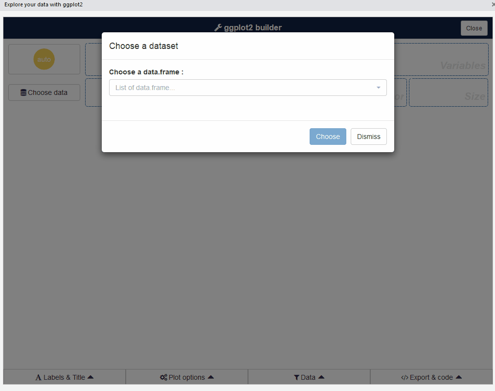
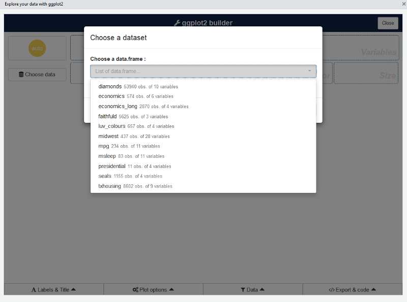
Then launch the add-in via the RStudio menu. If you don’t have data.framein your environment, datasets in ggplot2 are used.
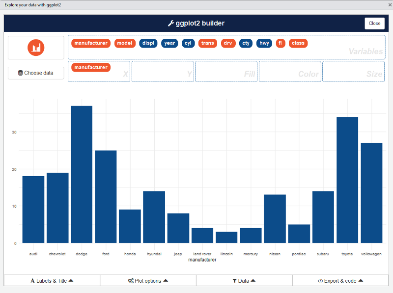
ggplot2 builder addin
Launch the add-in via the RStudio menu or with:
esquisse::esquisser()
The first step is to choose a data.frame:
Or you can use a dataset directly with:
esquisse::esquisser(data = iris)
After that, you can drag and drop variables to create a plot:
You can find information about the package and sub-menus in the original repo:
4. DataExplorer — Automate data exploration and treatment

https://github.com/boxuancui/DataExplorer
Exploratory Data Analysis (EDA) is an initial and important phase of data analysis/predictive modeling. During this process, analysts/modelers will have a first look of the data, and thus generate relevant hypotheses and decide next steps. However, the EDA process can be a hassle at times. This R package aims to automate most of data handling and visualization, so that users could focus on studying the data and extracting insights.
Installation
The package can be installed directly from CRAN.
install.packages("DataExplorer")
Usage
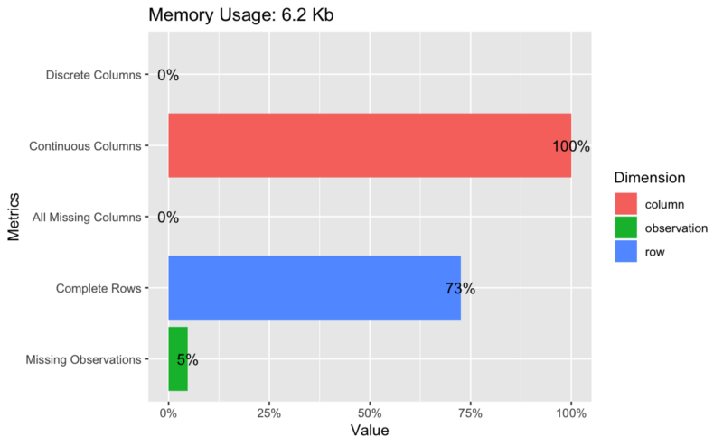
With the package you can create reports, plots, and tables like this:
## Plot basic description for airquality data
plot_intro(airquality)
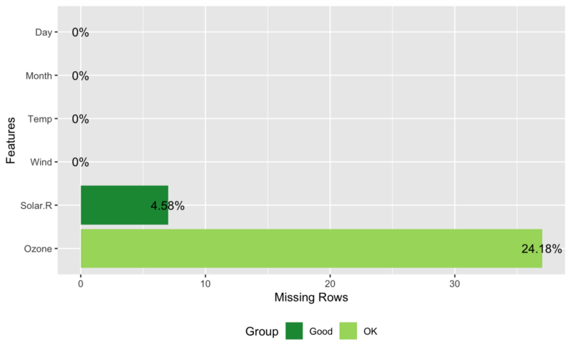
## View missing value distribution for airquality data
plot_missing(airquality)
## Left: frequency distribution of all discrete variables
plot_bar(diamonds)
## Right: `price` distribution of all discrete variables
plot_bar(diamonds, with = "price")
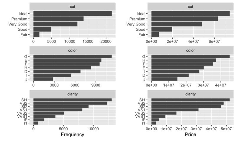
## View histogram of all continuous variables
plot_histogram(diamonds)
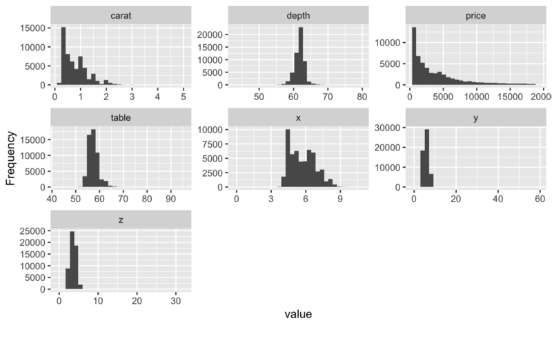
You can find much more like this on the package’s official webpage:
And in this vignette:
3. Sparklyr — R interface for Apache Spark

https://github.com/rstudio/sparklyr
Sparklyr will allow you to:
- Connect to Spark from R. The sparklyr package provides a
complete dplyr backend. - Filter and aggregate Spark datasets, and then bring them into R for
analysis and visualization. - Use Spark’s distributed machine learning library from R.
- Create extensions that call the full Spark API and provide
interfaces to Spark packages.
Installation
You can install the Sparklyr package from CRAN as follows:
install.packages("sparklyr")
You should also install a local version of Spark for development purposes:
library(sparklyr)
spark_install(version = "2.3.1")
Usage
The first part of using Spark is always creating a context and connecting to a local or remote cluster.
Here we’ll connect to a local instance of Spark via the spark_connect function:
library(sparklyr)
sc <- spark_connect(master = "local")
Using sparklyr with dplyr and ggplot2
We’ll start by copying some datasets from R into the Spark cluster (note that you may need to install the nycflights13 and Lahman packages in order to execute this code):
install.packages(c("nycflights13", "Lahman"))

library(dplyr)
iris_tbl <- copy_to(sc, iris)
flights_tbl <- copy_to(sc, nycflights13::flights, "flights")
batting_tbl <- copy_to(sc, Lahman::Batting, "batting")
src_tbls(sc)

## [1] "batting" "flights" "iris"
To start with, here’s a simple filtering example:
# filter by departure delay and print the first few records
flights_tbl %>% filter(dep_delay == 2)

## # Source:   lazy query [?? x 19]
## # Database: spark_connection
##     year month   day dep_time sched_dep_time dep_delay arr_time
##    <int> <int> <int>    <int>          <int>     <dbl>    <int>
##  1  2013     1     1      517            515         2      830
##  2  2013     1     1      542            540         2      923
##  3  2013     1     1      702            700         2     1058
##  4  2013     1     1      715            713         2      911
##  5  2013     1     1      752            750         2     1025
##  6  2013     1     1      917            915         2     1206
##  7  2013     1     1      932            930         2     1219
##  8  2013     1     1     1028           1026         2     1350
##  9  2013     1     1     1042           1040         2     1325
## 10  2013     1     1     1231           1229         2     1523
## # ... with more rows, and 12 more variables: sched_arr_time <int>,
## #   arr_delay <dbl>, carrier <chr>, flight <int>, tailnum <chr>,
## #   origin <chr>, dest <chr>, air_time <dbl>, distance <dbl>, hour <dbl>,
## #   minute <dbl>, time_hour <dttm>
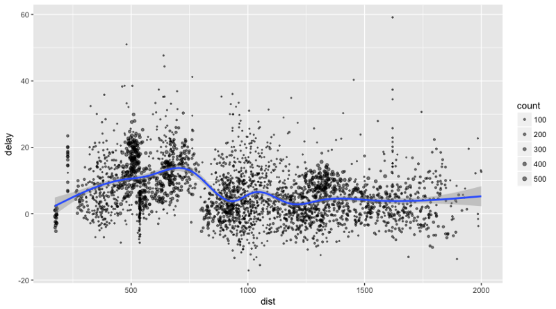
Let’s plot the data on flight delays:
delay <- flights_tbl %>%
  group_by(tailnum) %>%
  summarise(count = n(), dist = mean(distance), delay = mean(arr_delay)) %>%
  filter(count > 20, dist < 2000, !is.na(delay)) %>%
  collect

# plot delays
library(ggplot2)
ggplot(delay, aes(dist, delay)) +
  geom_point(aes(size = count), alpha = 1/2) +
  geom_smooth() +
  scale_size_area(max_size = 2)

## `geom_smooth()` using method = 'gam'
Machine Learning with Sparklyr
You can orchestrate machine learning algorithms in a Spark cluster via the machine learning functions within Sparklyr. These functions connect to a set of high-level APIs built on top of DataFrames that help you create and tune machine learning workflows.
Here’s an example where we use ml_linear_regression to fit a linear regression model. We’ll use the built-in mtcars dataset to see if we can predict a car’s fuel consumption (mpg) based on its weight (wt), and the number of cylinders the engine contains (cyl). We’ll assume in each case that the relationship between mpg and each of our features is linear.
# copy mtcars into spark
mtcars_tbl <- copy_to(sc, mtcars)

# transform our data set, and then partition into 'training', 'test'
partitions <- mtcars_tbl %>%
  filter(hp >= 100) %>%
  mutate(cyl8 = cyl == 8) %>%
  sdf_partition(training = 0.5, test = 0.5, seed = 1099)

# fit a linear model to the training dataset
fit <- partitions$training %>%
  ml_linear_regression(response = "mpg", features = c("wt", "cyl"))
fit

## Call: ml_linear_regression.tbl_spark(., response = "mpg", features = c("wt", "cyl"))
##
## Formula: mpg ~ wt + cyl
##
## Coefficients:
## (Intercept)          wt         cyl
##   33.499452   -2.818463   -0.923187
For linear regression models produced by Spark, we can use summary() to learn a bit more about the quality of our fit and the statistical significance of each of our predictors.
summary(fit)

## Call: ml_linear_regression.tbl_spark(., response = "mpg", features = c("wt", "cyl"))
##
## Deviance Residuals:
##    Min     1Q Median     3Q    Max
## -1.752 -1.134 -0.499  1.296  2.282
##
## Coefficients:
## (Intercept)          wt         cyl
##   33.499452   -2.818463   -0.923187
##
## R-Squared: 0.8274
## Root Mean Squared Error: 1.422
Spark machine learning supports a wide array of algorithms and feature transformations, and as illustrated above, it’s easy to chain these functions together with dplyr pipelines.
Check out more about machine learning with sparklyr here:
sparklyr
An R interface to Sparkspark.rstudio.com
And more information in general about the package and examples here:
sparklyr
An R interface to Sparkspark.rstudio.com
2. Drake — An R-focused pipeline toolkit for reproducibility and high-performance computing

Drake programming
Nope, just kidding. But the name of the package is drake!

https://github.com/ropensci/drake
This is such an amazing package. I’ll create a separate post with more details about it, so wait for that!

Drake is a package created as a general-purpose workflow manager for data-driven tasks. It rebuilds intermediate data objects when their dependencies change, and it skips work when the results are already up to date.
Also, not every run-through starts from scratch, and completed workflows have tangible evidence of reproducibility.
Reproducibility, good management, and tracking experiments are all necessary for easily testing others’ work and analysis. It’s a huge deal in Data Science, and you can read more about it here:
From Zach Scott:
And in an article by me 🙂
With drake, you can automatically
- Launch the parts that changed since last time.
- Skip the rest.
Installation
# Install the latest stable release from CRAN.
install.packages("drake")

# Alternatively, install the development version from GitHub.
install.packages("devtools")
library(devtools)
install_github("ropensci/drake")
There are some known errors when installing from CRAN. For more on these errors, visit:
The drake R Package User Manual
I encountered a mistake, so I recommend that for now you install the package from GitHub.
Ok, so let’s reproduce a simple example with a twist:
| #library(devtools) |
| #install_github(«ropensci/drake») |
| library(dplyr) |
| library(ggplot2) |
| library(drake) |
| # Donwload neccesary data |
| drake_example(«main») |
| # Check if data and report exists |
| file.exists(«main/raw_data.xlsx») |
| file.exists(«main/report.Rmd») |
| # Crate a custom plot function |
| create_plot <- function(data) { |
| ggplot(data, aes(x = Petal.Width, fill = Species)) + |
| geom_histogram(binwidth = 0.25) + |
| theme_gray(20) |
| } |
| plot_lm <- function(data) { |
| ggplot(data = data, aes(x = Petal.Width, y = Sepal.Width)) + |
| geom_point(color=’red’) + |
| stat_smooth(method = «lm», col = «red») |
| } |
| # Create the plan |
| plan <- drake_plan( |
| raw_data = readxl::read_excel(file_in(«main/raw_data.xlsx»)), |
| data = raw_data %>% |
| mutate(Species = forcats::fct_inorder(Species)) %>% |
| select(-X__1), |
| hist = create_plot(data), |
| cor = cor(data$Petal.Width,data$Sepal.Width), |
| fit = lm(Sepal.Width ~ Petal.Width + Species, data), |
| plot = plot_lm(data), |
| report = rmarkdown::render( |
| knitr_in(«main/report.Rmd»), |
| output_file = file_out(«main/report.html»), |
| quiet = TRUE |
| ) |
| ) |
| plan |
| # Excecute the plan |
| make(plan) |
| # Interactive graph: hover, zoom, drag, etc. |
| config <- drake_config(plan) |
| vis_drake_graph(config) |
view rawdrake_example.R hosted with ❤ by GitHub
I added a simple plot to see the linear model within drake’s main example. With this code, you’re creating a plan for executing your whole project.
First, we read the data. Then we prepare it for analysis, create a simple hist, calculate the correlation, fit the model, plot the linear model, and finally create a rmarkdown report.
The code I used for the final report is here:
| — |
| title: «Example R Markdown drake file target» |
| author: Will Landau, Kirill Müller and Favio 😉 |
| output: html_document |
| — |
| Run `make.R` to generate the output `report.pdf` and its dependencies. Because we use `loadd()` and `readd()` below, `drake` knows `report.pdf` depends on targets `fit`, and `hist`. |
| «`{r content} |
| library(drake) |
| loadd(fit) |
| print(fit) |
| loadd(cor) |
| print(cor) |
| readd(hist) |
| readd(plot) |
| «` |
| More: |
| – Walkthrough: [this chapter of the user manual](https://ropenscilabs.github.io/drake-manual/intro.html) |
| – Slides: [https://krlmlr.github.io/drake-pitch](https://krlmlr.github.io/drake-pitch) |
| – Code: `drake_example(«main»)` |
view rawreport.Rmd hosted with ❤ by GitHub
If we change some of our functions or analysis, when we execute the plan, drake will know what has changed and will only run those changes. It creates a graph so you can see what’s happening:
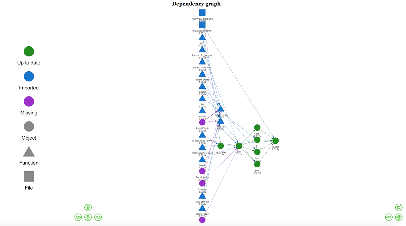
Graph for analysis
In Rstudio, this graph is interactive, and you can save it to HTML for later analysis.
There are more awesome things that you can do with drake that I’ll show in a future post 🙂
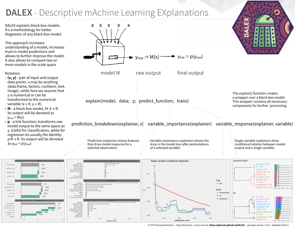
1. DALEX — Descriptive mAchine Learning EXplanations

https://github.com/pbiecek/DALEX
Explaining machine learning models isn’t always easy. Yet it’s so important for a range of business applications. Luckily, there are some great libraries that help us with this task. For example:
(By the way, sometimes a simple visualization with ggplot can help you explain a model. For more on this check the awesome article below by Matthew Mayo)
In many applications, we need to know, understand, or prove how input variables are used in the model, and how they impact final model predictions.DALEX is a set of tools that helps explain how complex models are working.
To install from CRAN, just run:
install.packages("DALEX")
They have amazing documentation on how to use DALEX with different ML packages:
- How to use DALEX with caret
- How to use DALEX with mlr
- How to use DALEX with H2O
- How to use DALEX with xgboost package
- How to use DALEX for teaching. Part 1
- How to use DALEX for teaching. Part 2
- breakDown vs lime vs shapleyR
Great cheat sheets:
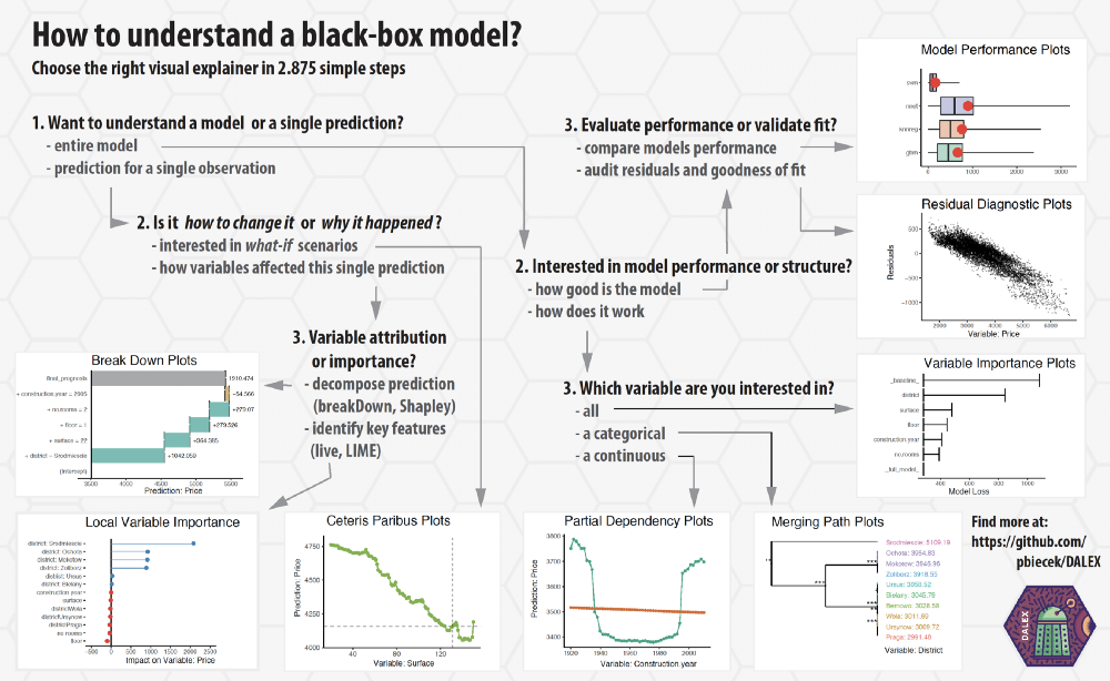
https://github.com/pbiecek/DALEX
https://github.com/pbiecek/DALEX
Here’s an interactive notebook where you can learn more about the package:
Binder (beta)
Edit descriptionmybinder.org
And finally, some book-style documentation on DALEX, machine learning, and explainability:
Check it out in the original repository:
pbiecek/DALEX
DALEX — Descriptive mAchine Learning EXplanationsgithub.com
and remember to star it 🙂
